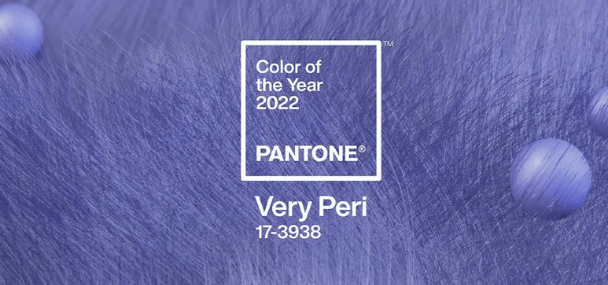
Pantone Color of the Year Very Peri combines the
“constant tranquility of blue with an energetic infusion of red”
Ver esta publicação no Instagram
For over 20 years, Pantone has been setting color trends for each year. Similar to what happened in other years, for 2022, Pantone chose a new color, Very Peri 17-3938, which represents the future, change and modernity. In this article, we will see how it is chosen, what the experts are based on to make the selection, followed by ways to use Very Peri and color combinations.
How is Pantone’s Color of the Year chosen?
In order to select the color that will dictate the trends of the year, rigorous research is carried out around the most used colors in different industries such as fashion, technology, design, interiors, art, tourist destinations, etc. Therefore, experts analyze the various areas of interest, which have a great impact on the world, and select a color that fits.
Why was the Very Peri tone created?
For the first time, Pantone has created an entirely new shade rather than selecting one from its color palette. This is because: “Creating a new color for the first time in the history of our ‘Pantone Color of the Year’ color program reflects the innovation and global transformation that is taking place,” said Laurie Pressman, vice president of Pantone Color. Institute. In this way Very Peri symbolizes the times of transformation that we are going through. Created to stimulate creativity and transformation in order to open new paths and possibilities.
“Very Peri brings a cheerful, positive attitude and dynamic presence that encourages unprecedented creativity and imaginative expression,” said Laurie Pressman.
Undeniably, PANTONE 17-3938 Very Peri puts the future ahead in a new light, it’s a bold combination of blue, which conveys tranquility, and red, a vibrant and energetic color.
Whether in the small details or with grandeur, there are several ways to use Very Peri in decoration.
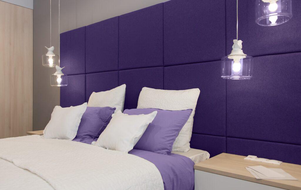
5 Ideas to use the Very Peri color in the bedroom:
Very Peri is a dynamic, versatile color with many possibilities for bedroom decor. It will certainly give the room decor a more playful and informal side.
According to color psychology, purple tones are associated with delicacy, elegance, relaxation and imagination. That’s why this is one of the ideal colors to use in your bedroom, as it will promote relaxation for a more peaceful sleep.
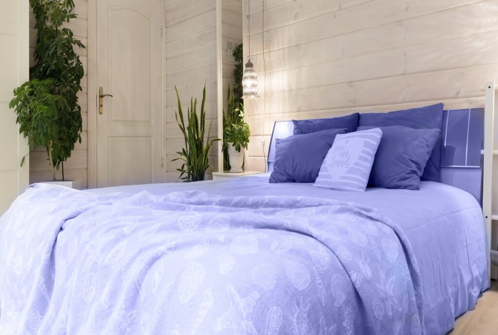
Bedroom textiles
Textiles such as blankets, rugs and curtains are fundamental pieces in the bedroom, often used in order to make the room more cozy.
Armchair
This color is so elegant that it will easily look good on a bedroom armchair without losing style and will enhance the elegance of the space.
Headboard
The headboard is one of the main pieces of the bedroom, so if you want your bed to be highlighted by the headboard, opt for an upholstered headboard in the very peri color for a comforting bedroom.
Accessories
If you like this color, but are afraid that it will stand out too much, you can use it in small accessories such as candles, vases, lamps, paintings and pillows.
Walls
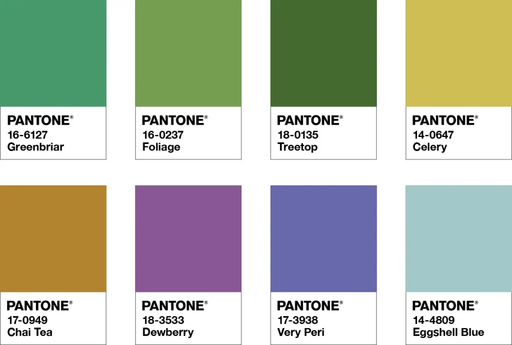
You can use this color on the walls, but pay special attention to the colors you are going to match, that’s why we leave in this article the palettes created by Pantone for inspiration.
Color palettes to match Very Peri
In order to help incorporate the Very Peri color into decorations, Pantone has created different color palettes:
Balancing Act
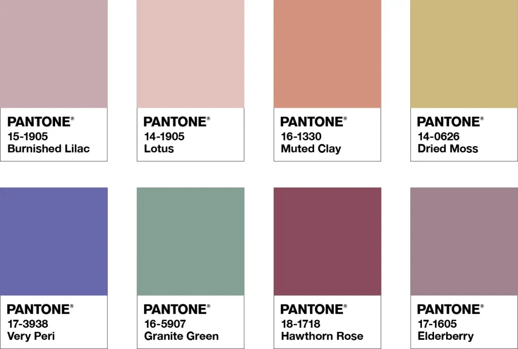
Wellspring
The Star Of The Show
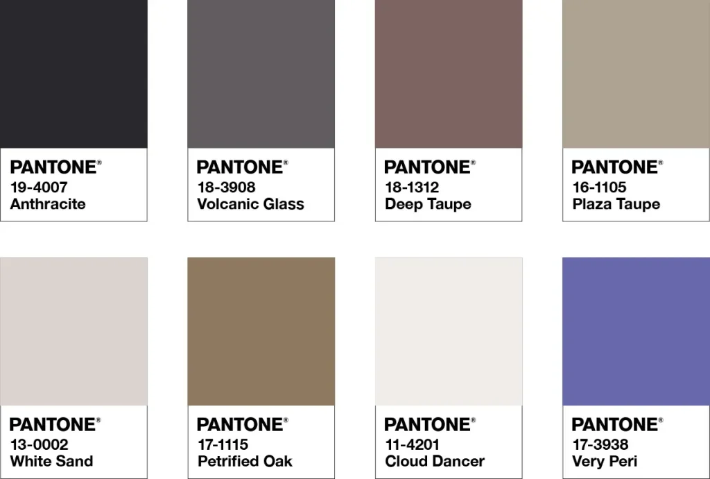
Amusements
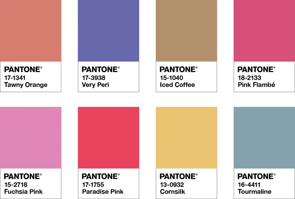
With these pallets you will prove the versatility of the Very Peri 17-3938 pantone and be able to create different environments, with different energies.
Author: Inês Estrela
You may also like:
